


- FITNESS REVOLUTION
Overview
The unexpected global pandemic has changed how people workout. Meanwhile, gyms keeping their doors closed, there is no surprise that home workouts have become the new way to go. Many fitness companies have shifted to offering workout content in the form of online tutorials, on-demand classes, workout apps, etc.
Like many fitness enthusiasts, I have been jumping through hoops in the last few months to find “gym-alternatives” that fit into my fitness level and preferences. I found that following online workout videos to be a great way to stay active at home. However, the lack of real interaction with the trainers for personalized coaching makes it hard for people to stick with a routine and make progress.
Tools:
Figma, Adobe Illustrator
Design Guidelines:
iOS Human Interface Guidelines
Deliverables:
Problem definition| Value proposition | User Persona | Wireframes | Visual Language | Mood Board | Style Tile |Interactive Prototypes and Mobile, Tablet and Laptop Mockup iOS. | Style Guide.
My Role: UI/UX Designer
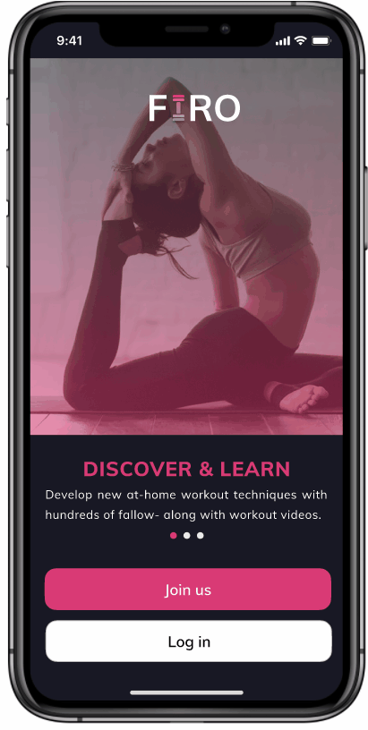
Purpose: FIRO is a mobile app concept I developed for my UI for UX Design certification course in CareerFoundry. The goal of the project was to design mobile, tablet, and desktop app interfaces for the platforms adhering to the existing design guidelines.
My Design Process

App Concept

Problem definition
The problem can be defined as the difficulty to keep up with the daily fitness routine because of closed fitness studios during the ongoing pandemic. It is challenging for people to stay motivated and engage in fitness routines.
Value proposition
User Persona
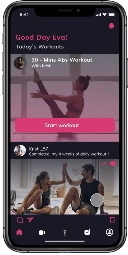
FIRO is a revolutionary fitness coaching app that is specially made to keep track of daily fitness routines including fitness trainer bookings.
The app improves the enthusiasm for workouts meanwhile providing a set of video clips by targeting three different levels of users as beginner, intermediate, and advance.
FIRO connects users with online workout coaching sessions and coaching programs.
The App’s newsfeed keeps the community of FIRO users up to date with the workout routines and sessions meanwhile providing a platform to communicate with each other to be motivated.


Wireframes
After I had a better understanding of user goals and behaviors, I have listed some key features of the app below in order to create low-fidelity wireframes.
1. News Feed - A social sharing platform to communicate and stay in tach with other fitness enthusiasts
2. List of online trainers (sort by Ratings)
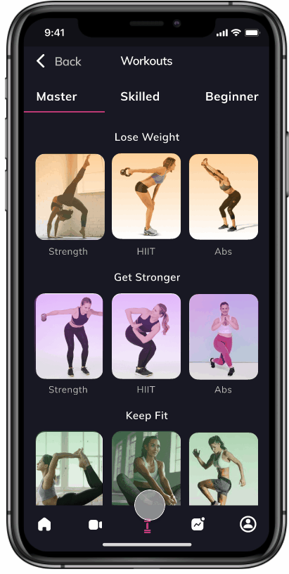
3. List of fitness tutorials (sort by master, skilled, beginner level )
4. Analytical Statistics about a daily fitness routine.
5. My profile where the user can customize the choices, connect the other devices with the application.
6. Instant message with trainers (for inquiry)
Low fidelity Wireframes

Mid fidelity Wireframes
.png)
Visual Language
Languages are made up of different types of words that can be assembled together to create a message. Visual language is like any other language. The words of visual language can be grouped into color, space, shape, and movement.
I interviewed a few users to understand their needs and discovered the moods of the app to further define the visual language.
Interview Questions:
1. Why would you use this app?
2. What mood would facilitate for these needs to be fulfilled?
3. How could you communicate this mood through visual language? (color, space, shape, and movement.)
.png)
Mood Board
I created two distinctive mood boards to present the feelings targeting different user groups. The first one is quiet, clean, and minimal which conveys rustic, natural, and reliable mood and the second one is exciting, youthful, and fast-paced which conveys passionate and positive moods.
.png)
Style Tile


I interviewed 10 of my friends to choose their favorite style. It turned out that 2/3 of them preferred the first visual style. Here are some quotes.
“I like the first one because it’s visually energizing and I am getting the motivational, young, and fun feeling in the app.”
“The first one is Joyful. I like the shading effect for the imagers, it makes more fun.”
“The second style is more visually appealing but it seems to be a little too much neutral for a fitness application app.”
UI & Prototype
After I decided on the visual style, I applied it to the mid-fidelity wireframes and did a few design iterations. Then, I created the interactive Figma Prototype with the following high-fidelity user interfaces together with Interactions & Gestures.


UI Design for Different Breakpoints
I’ve taken a mobile-first approach for this design case study. It was designed for a mobile breakpoint and then adapted content for larger breakpoints.
.png)


.png)


Reflection
.png)
.png)
Style Guide
.png)
.jpg)
What's next for this project?
-
Continue testing and validating the ideas before and after launching any features. Defining a proper measurement for success is one of the keys to validate the test results.
-
Continue to flesh out the tablet and desktop versions to completion.

